|
|
Relaxo Footwear Ltd. had so far been successfully established in the rural and selected sections of urban markets. It now planned to enter the retail markets of the urban sector. Therefore, the brand had to be repositioned.
For my project, I worked on two major assignments for Relaxo.
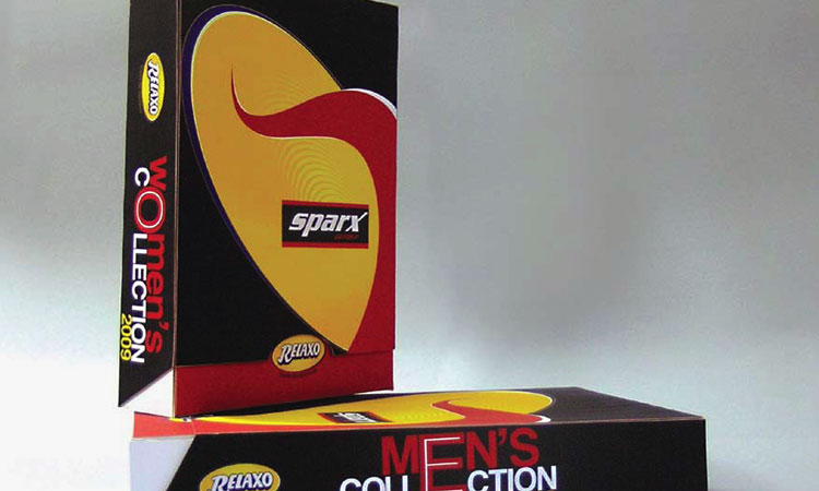
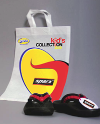
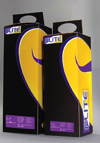
The former consisted of developing packaging for two products SPARX and FLITE.
For both, I designed packaging with interactive features of handles that generate portability. One generic visual graphic is used to build the brand identity for both the sub-brands. I brought each brand and different sub brand into focus with structural variation and color coding. The Relaxo brand identity works as its sole and the form depicts motion and forward movement. The overall design creates dynamism. Each shoe box is accompanied with shoe wrapping paper and shoe tag.
The second assignment consisted of refining the logo of the parent identity. The present identity was too simple with a distinct feature, colors were not constant in every medium; the typeface was not well defined, and there was no fixed position for its tag line, Quality Par Excellence. In addition, the thickness of the lines needed to remain consistent in every medium. The rebranding initiative related to achieving consistency in all these areas.
My design philosophy in this project has been two-fold. First, function over design and second, less is more in packaging. My key learning through this experience is that design is not a linear process and it is iterative which has instilled a considerable amount of flexibility in my design approach. |